
Freelance Designer and Branding Consultant


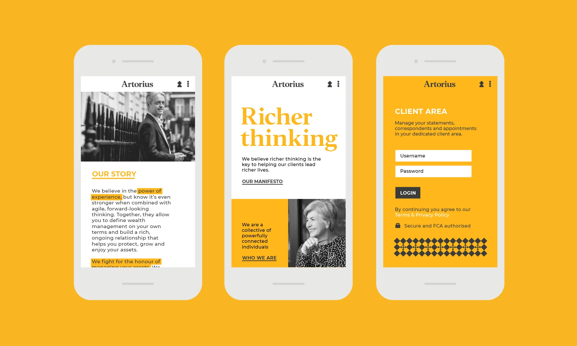

Artorius are a team of high-end wealth management experts with offices in London, Manchester and Zurich. Their agile, fresh-thinking approach challenged industry traditions and they wanted an equally fresh visual identity to help them communicate the forward-looking essence of their business.
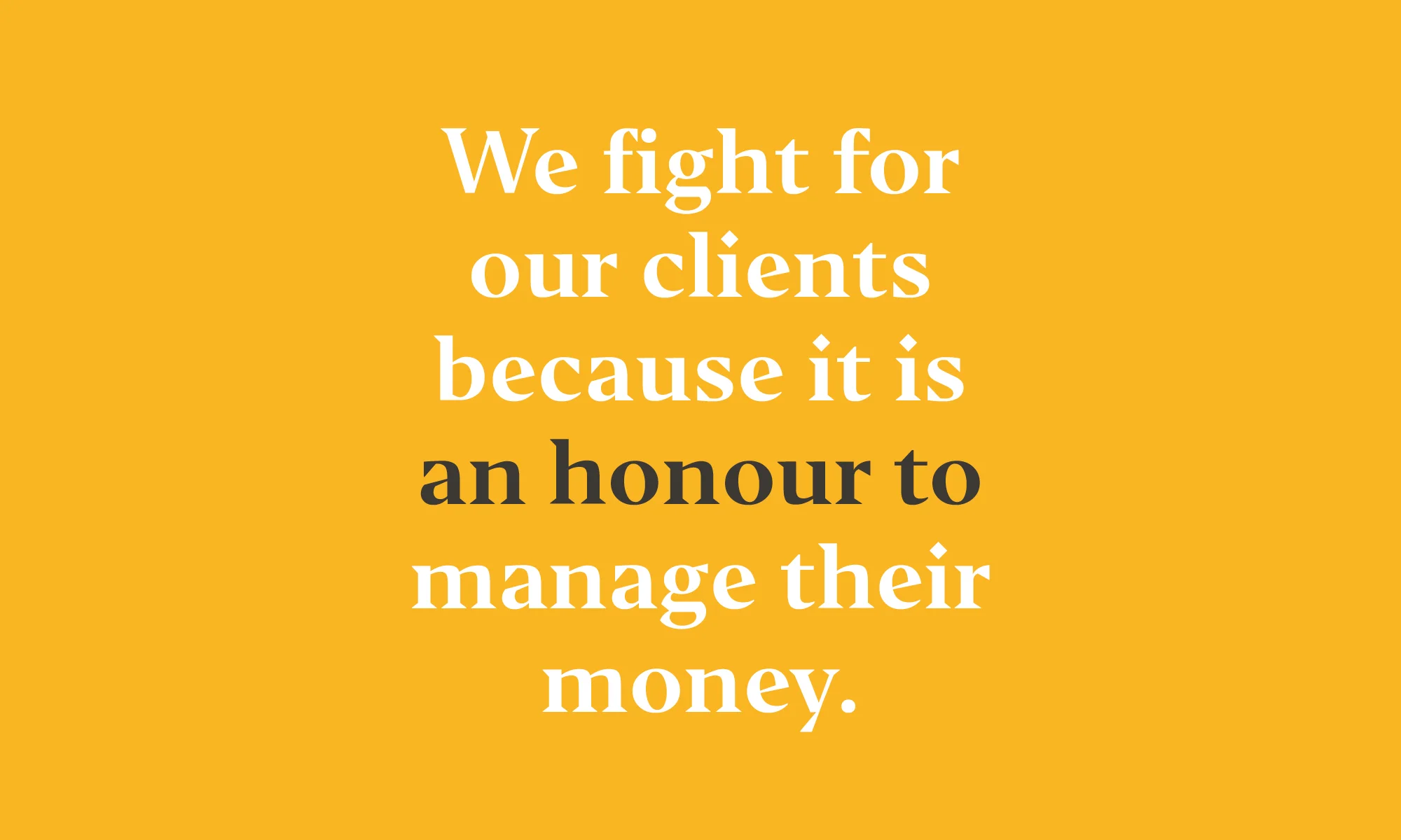
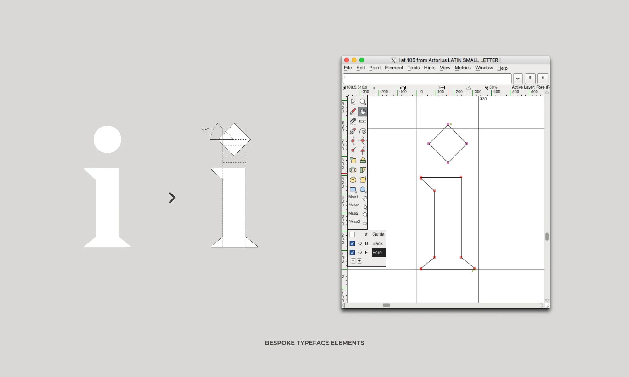
To communicate this dynamic approach to traditional wealth management, we took the simple concept of a square being turned on it's side to make a diamond. Through this a new visual identity was formed with a new logo with bold geometric lines. To represent the concept of “Richer
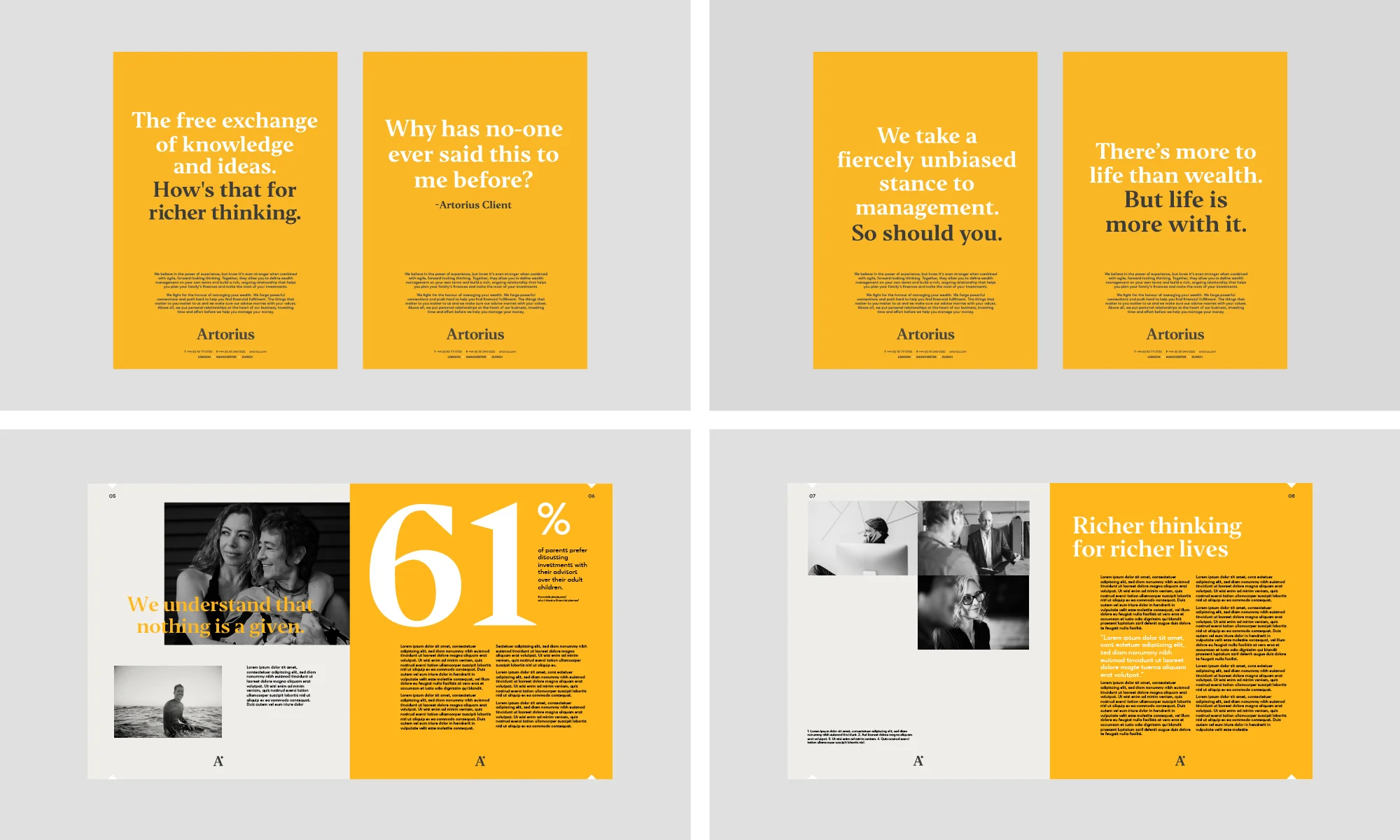
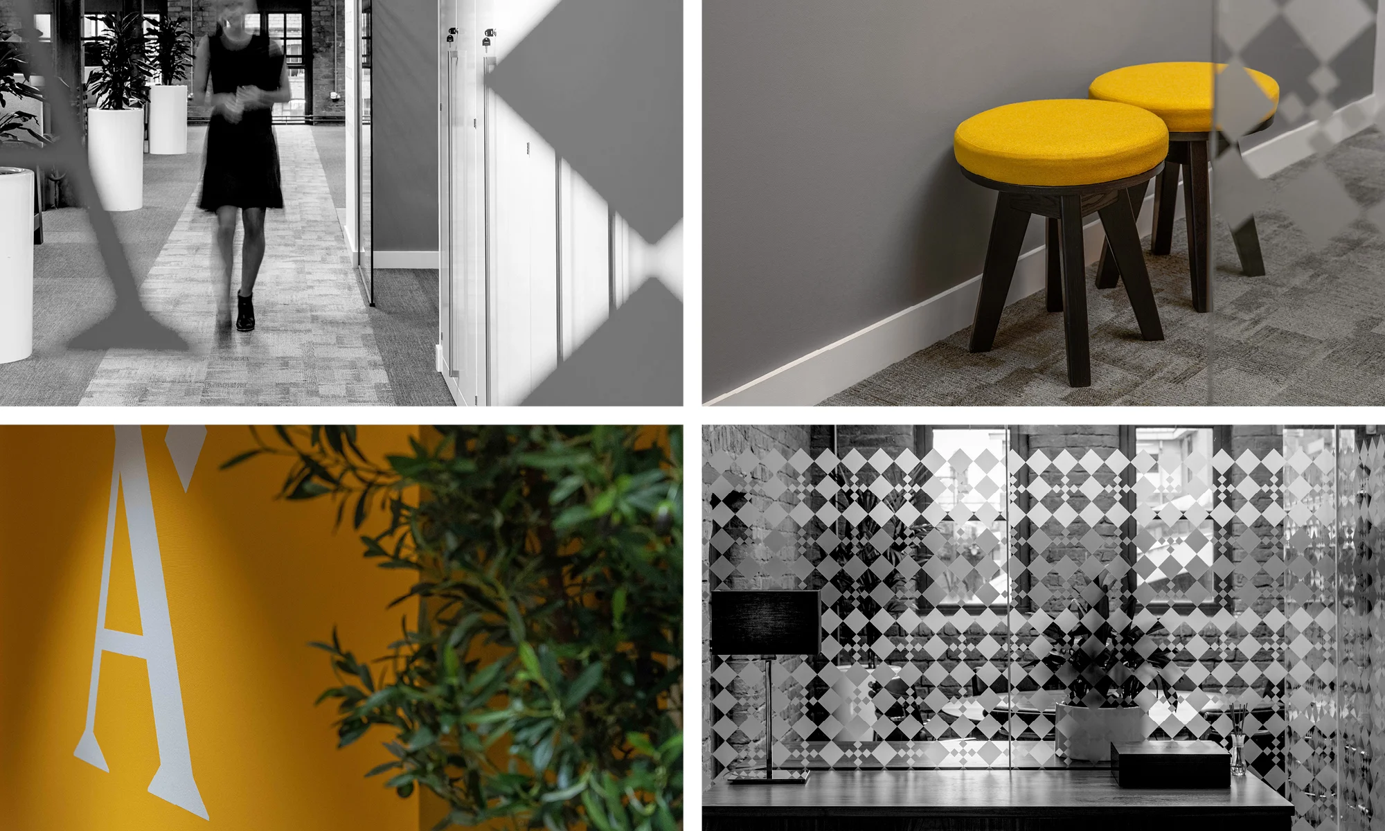
The brand was delivered though stationary, interior concepts for each location, a responsive website design, print advertising
The springboard for their new visual identity came from tipping a square on its side to demonstrate their more dynamic approach. This led us to an elegant, modern identity that was rolled out across literature, interiors and their website.
“We needed to take a fresh approach to our brand. 10 made our firm look relevant, smarter and modern and helped us engage a wide range of stakeholders including all employees, as well as some key shareholders and clients. This ensured total buy-in to the outcome. They were innovative and great fun to work with. I love the colour, and the square on its side is masterful.”
Ian Marsh, CEO, Artorius